Book Themes, Part 1: Frames and Pictures
One of the most complex aspects of Pressbooks is the way our book themes work across different formats. It even confuses us sometimes. In a series of posts this week, I hope to clarify some of the concepts that underpin our book theming system, reflect on how it has evolved over the years, and outline where we hope to take book themes in the future.
A Framing Device
Conceptually, I find it helpful to think of our book themes as two things: a frame and a picture.

Take McLuhan, our default book theme. It's really two elements in one. The first element is a (fairly conventional) WordPress theme which provides the user interface for reading a Pressbooks book on the web. This is the "frame" — the user interface (UI) for readers of a webbook. The other component is the "picture" — styles which format the content of the book for display, either within the webbook "frame" or in other formats such as PDF, EPUB, or MOBI.
McLuhan provides the UI for all Pressbooks webbooks, even those that use other styles for their content. All other book themes are WordPress child themes, which means that they inherit the "frame" (the webbook UI) from McLuhan, the parent theme[1]. So if you change your book's theme to Jacobs, you're putting a new "picture" in the original frame:

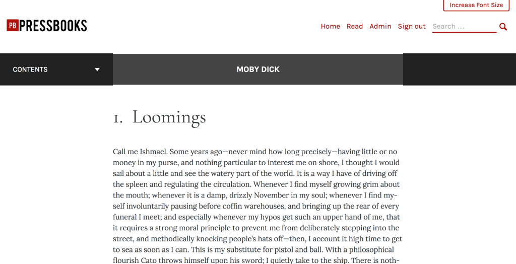
To demonstrate this more concretely, here's a webbook using McLuhan:

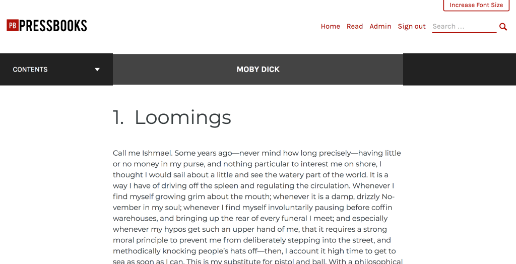
And the same webbook using Jacobs:

No difference except the typography of the book content.
Luther's Legacy
Our old default book theme was Luther. When we built Luther, we made a tactical error and mixed the content styles for web into the UI styles. By failing to separate these concerns, we made the transition from Luther to McLuhan more awkward than it could have been; when we rebuilt the webbook UI in McLuhan, we had to supply some (now missing) content styles for old themes[2] that had been relying on the Luther webbook stylesheet to properly display some of the webbook content. We've learned from this mistake, and all of our work on webbook UI and web content styles going forward will emphasize a proper separation of concerns.
Next: What's Buckram?
The next part of this series will be a deep dive into Buckram, the SCSS book component library that is at the heart of our new batch of themes. Until next time!
That being said, child themes can override components of the parent themes, so one could make a child theme that changed any aspect of the webbook UI by replacing or modifying template files. ↩︎
Only old themes, though! More on that in part two. ↩︎
